Project

National Security Agency - Website Redesign

Challenge

Our team was tasked with redesigning the National Security Agency’s website to improve its information architecture and overall user experience. The goal was to create a more accessible, intuitive, and user-friendly interface, addressing navigation challenges and optimizing content discoverability for a diverse audience.

My Role

As the UX/UI Designer, I was responsible for:

  • Conducting guerrilla user testing to evaluate usability.

  • Implementing card sorting to refine the information architecture.

  • Designing user flows and creating flowcharts to map navigation paths.

  • Creating low- and high-fidelity prototypes to test and implement design improvements.

Restructuring the

Information Architecture

Restructuring the

Information Architecture

To address the primary challenge of a disorganized structure, we began by mapping user flows to visualize how visitors interacted with the site. Using card sorting exercises, we reorganized the content into logical, intuitive categories, simplifying navigation and improving usability. This process provided a clear roadmap for restructuring the site’s information architecture and reducing friction in content discovery.

To address the primary challenge of a disorganized structure, we began by mapping user flows to visualize how visitors interacted with the site. Using card sorting exercises, we reorganized the content into logical, intuitive categories, simplifying navigation and improving usability. This process provided a clear roadmap for restructuring the site’s information architecture and reducing friction in content discovery.

User Research &

Guerrilla Testing

User Research &

Guerrilla Testing

We conducted guerrilla user testing to analyze the usability of the current site. These quick, informal sessions allowed us to observe user behavior and identify pain points in real-time.

We conducted guerrilla user testing to analyze the usability of the current site. These quick, informal sessions allowed us to observe user behavior and identify pain points in real-time.

Key Insights:

Key Insights:

Clear Paths: Users easily located key sections like the Leadership page, with a 100% task success rate.


Navigation Issues: Only 50% of users could locate the Central Security Service page, highlighting gaps in specialized content discoverability.


Search Function Limitations: Users struggled with the search bar’s placement and functionality, impacting their ability to locate specific content efficiently.


Minor Friction Points: Reaching the News & Highlights page presented some challenges, with an 82.5% success rate.
Redesigning the

Navigation System

Redesigning the

Navigation System

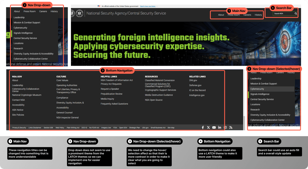
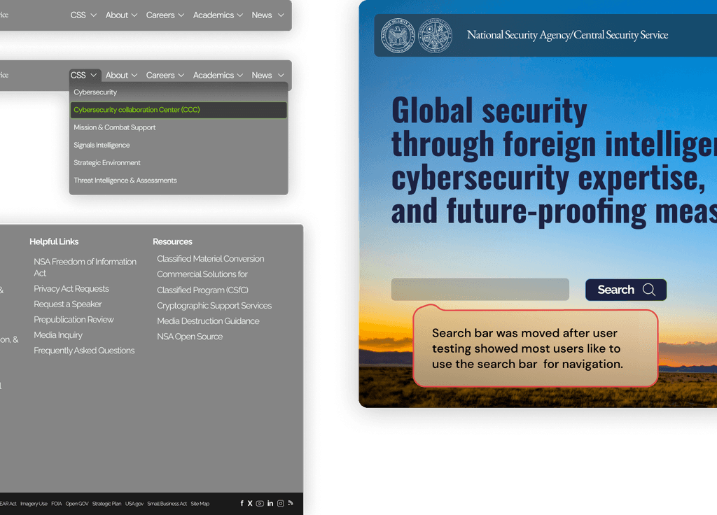
Based on our research findings, we restructured the navigation system to enhance clarity and usability. To improve comprehension, we introduced clearer labels that are easier for users to understand. We also implemented stronger hover effects to provide better visual feedback during navigation. The search bar was enhanced for greater visibility and functionality, making it more accessible and user-friendly.

Based on our research findings, we restructured the navigation system to enhance clarity and usability. To improve comprehension, we introduced clearer labels that are easier for users to understand. We also implemented stronger hover effects to provide better visual feedback during navigation. The search bar was enhanced for greater visibility and functionality, making it more accessible and user-friendly.

Prototyping and

Iterative Refinement

Prototyping and

Iterative Refinement

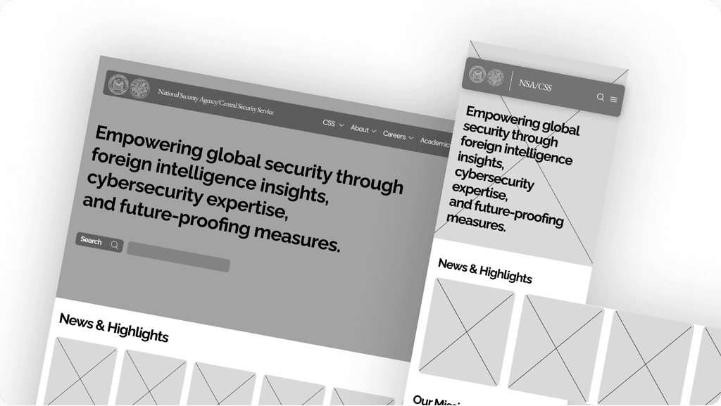
We created low-fidelity prototypes for desktop and mobile to establish a responsive design with clear hierarchy and streamlined navigation. Using A/B testing, we evaluated variations of navigation elements, layouts, and visual components. This approach provided actionable feedback that informed our design decisions, ensuring the user interface aligned with user preferences and needs.

We created low-fidelity prototypes for desktop and mobile to establish a responsive design with clear hierarchy and streamlined navigation. Using A/B testing, we evaluated variations of navigation elements, layouts, and visual components. This approach provided actionable feedback that informed our design decisions, ensuring the user interface aligned with user preferences and needs.

Refining with A/B Testing

& High-Fidelity Prototypes

Refining with A/B Testing

& High-Fidelity Prototypes

After creating our initial prototypes, we conducted
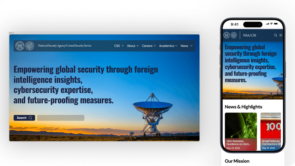
A/B testing to evaluate different design elements and refine the user interface. Using feedback from these tests, along with a UI style tile to guide our visual choices, we finalized the high-fidelity prototype with the new navigation. This iterative process helped us ensure a cohesive and user-friendly design that aligned with our goals.

After creating our initial prototypes, we conducted
A/B testing to evaluate different design elements and refine the user interface. Using feedback from these tests, along with a UI style tile to guide our visual choices, we finalized the high-fidelity prototype with the new navigation. This process helped us ensure a cohesive and user-friendly design that aligned with our goals.

Conclusion

Conclusion

Redesigning this website highlighted the importance of clear structure and intuitive navigation, reinforcing the need to approach challenges with strategic thinking and creativity. I aim to explore more efficient methods for card sorting. Moving forward, we’ll prioritize testing and iteration, always seeking opportunities to refine and enhance the user experience.

Redesigning this website highlighted the importance of clear structure and intuitive navigation, reinforcing the need to approach challenges with strategic thinking and creativity. I aim to explore more efficient methods for card sorting. Moving forward, we’ll prioritize testing and iteration, always seeking opportunities to refine and enhance the user experience.