Summary
Summary
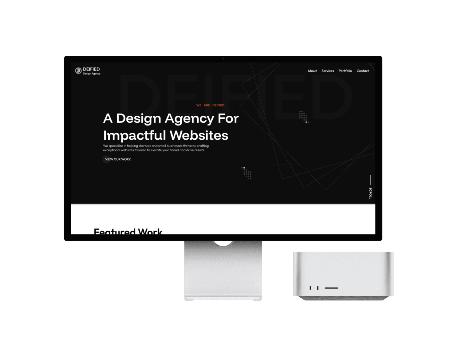
Designing an Innovative Website for a New Design Agency
Designing an Innovative Website for a New Design Agency
The Challenge
The Challenge
The challenge was to design a visually striking, user-centric website for a new design agency, overcoming limited content and a nascent brand while ensuring scalability.
The Solution
The Solution
Defining a target audience and balancing creativity with functionality. Through collaboration and iteration, we delivered a design aligned with the agency’s vision and user needs.
My Role
My Role
Lead UX/UI Designer in a team of 4
Lead UX/UI Designer in a team of 4
The Process
The Process
User Research
User Flows
MiFi Wireframes
HiFi UI Iterations
Style Guide
Development
User Research
User Flows
MiFi Wireframes
HiFi UI Iterations
Style Guide
Development
Tools
Tools
Zoom
Figma
Framer
Zoom
Figma
Framer
The brief
The brief
Kick-Off Meeting
Kick-Off Meeting
The team and I received a client brief to better understand the goals for the platform. From the brief, we learned that the client's target audience consists of small business owners. These were important factors to consider, as the client defined success as an engaging platform that retained users and attracted new ones. The team was tasked with creating a platform that was intuitive, innovative, and tailored to the needs of small businesses.
Research process
Research process
Methods Used
Methods Used
User Interviews
User Interviews
Information Architecture
Information Architecture
Competitor Analysis
Competitor Analysis
Persona
Persona
Affinity Diagram
Affinity Diagram
Competitor Analysis
To gain a deeper understanding of the client's industry, I conducted extensive research on small-business-focused design agencies. I analyzed countless websites, evaluating hierarchy, common themes, and user experience patterns. This competitive analysis helped me identify key areas for improvement and set a strong foundation for our approach.
To gain a deeper understanding of the client's industry, I conducted extensive research on small-business-focused design agencies. I analyzed countless websites, evaluating hierarchy, common themes, and user experience patterns. This competitive analysis helped me identify key areas for improvement and set a strong foundation for our approach.
I found that most small-business-oriented sites:
Showcase recent work to establish credibility
Clearly outline their design process and deliverables
Utilize strong visuals, art, and color to reinforce branding
Feature testimonials or other social proof to build trust and authority
I found that most small-business-oriented sites:
Showcase recent work to establish credibility
Clearly outline their design process and deliverables
Utilize strong visuals, art, and color to reinforce branding
Feature testimonials or other social proof to build trust and authority
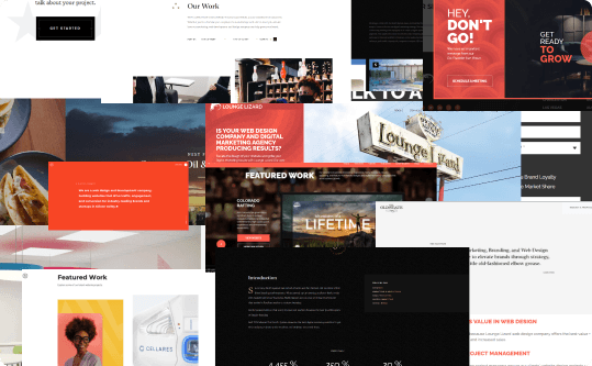
Screenshots of popular web design agency sites
Screenshots of popular design agency sites
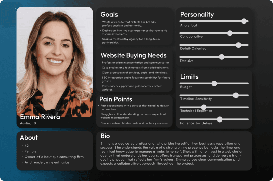
User Persona I formulated from our user research
User Persona
While working closely with the client to meet their needs, we also conducted user interviews and compiled our findings into an affinity diagram. This process revealed key insights about our target audience:
Users seek proof of credibility, such as recent work and a portfolio.
Many are hesitant to work with agencies due to concerns about cost and risk.
Transparency and clear communication throughout the design process are essential.
Using this information, we developed three distinct user personas, each representing a core user type. I created Emma, the owner of a boutique consulting firm, to embody the needs and challenges of small business owners. These personas helped guide our design decisions, ensuring they aligned with user goals, addressed pain points, and created a seamless experience.
Using this information, we developed three distinct user personas, each representing a core user type. I created Emma, the owner of a boutique consulting firm, to embody the needs and challenges of small business owners. These personas helped guide our design decisions, ensuring they aligned with user goals, addressed pain points, and created a seamless experience.
Ideation
Ideation
Feature Prioritization
After completing our user research, we moved into the ideation phase of the process. Using an I Like, I Wish, What If exercise, we brainstormed key features and ideas to incorporate into the platform. To refine our focus, we applied a feature prioritization matrix to determine which elements would have the greatest impact while remaining feasible.
After completing our user research, we moved into the ideation phase of the process. Using an I Like, I Wish, What If exercise, we brainstormed key features and ideas to incorporate into the platform. To refine our focus, we applied a feature prioritization matrix to determine which elements would have the greatest impact while remaining feasible.
A major consideration throughout this process was technical feasibility. Since the client preferred to stay on a no-code platform like Framer, we had to ensure our design choices aligned with those constraints. With this in mind, we prioritized the following key features:
A professional, modern, and consistent design.
Case studies showcasing previous clients and their results.
A clear, easy-to-follow design process guide.
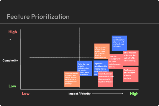
Feature Prioritization matrix to ensure technical feasibility
Feature Prioritization matrix to ensure
technical feasibility
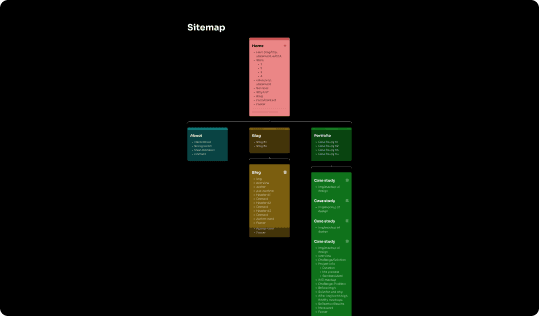
Our site-map I worked on the portfolio and case study pages
User Flow & Site Map
My team and I identified four main user flows that were essential to the platform's functionality. I took the lead on designing the portfolio page and the case study CMS pages, while my team members focused on other key flows. Each of us was responsible for wireframing and designing our assigned user flows to ensure efficiency. Throughout the design process, we maintained open communication to ensure a seamless and cohesive user experience.
My team and I identified four main user flows that were essential to the platform's functionality. I took the lead on designing the portfolio page and the case study CMS pages, while my team members focused on other key flows. Each of us was responsible for wireframing and designing our assigned user flows to ensure efficiency. Throughout the design process, we maintained open communication to ensure a seamless and cohesive user experience.
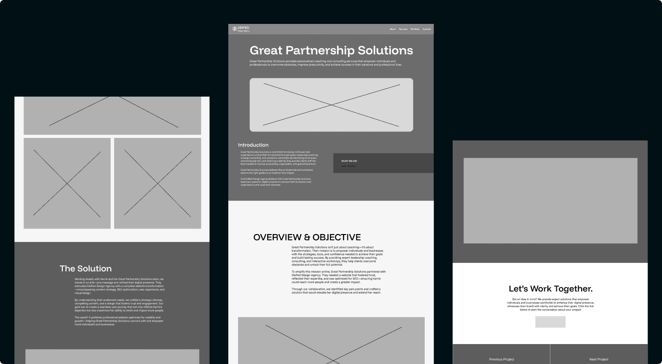
Wireframes
My team and I developed medium-fidelity wireframes to present our ideas to the client before moving on to the high-fidelity mockups. I focused on the portfolio page and the case study CMS pages, while each of my team members took on one of the other screens. We reorganized the layout of each page to enhance usability, incorporating new features and details that made the platform more engaging and trustworthy.
My team and I developed medium-fidelity wireframes to present our ideas to the client before moving on to the high-fidelity mockups. I focused on the portfolio page and the case study CMS pages, while each of my team members took on one of the other screens. We reorganized the layout of each page to enhance usability, incorporating new features and details that made the platform more engaging and trustworthy.
Design & Iterations
Design & Iterations
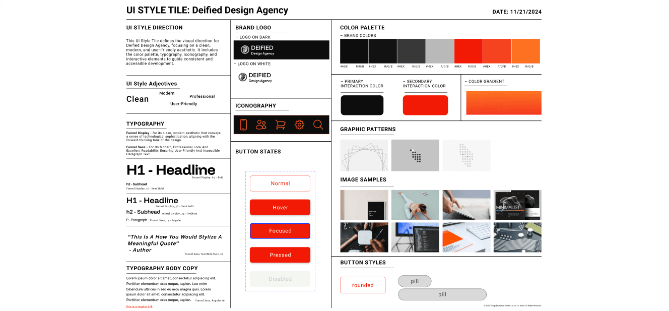
Style Guide
The client had some initial color preferences but was also open to exploring color psychology to establish a brand identity that evoked positive feelings around change while meeting accessibility standards. We developed a color palette that reflected these goals, centering the brand colors around warm reds and oranges. We also defined typography standards that provided balance in hierarchy and spacing. To ensure consistency across the design, we included commonly used UI elements in the style guide. This guide was referenced throughout the process as we refined the high-fidelity screens through multiple iterations.
The client had some initial color preferences but was also open to exploring color psychology to establish a brand identity that evoked positive feelings around change while meeting accessibility standards. We developed a color palette that reflected these goals, centering the brand colors around warm reds and oranges. We also defined typography standards that provided balance in hierarchy and spacing. To ensure consistency across the design, we included commonly used UI elements in the style guide. This guide was referenced throughout the process as we refined the high-fidelity screens through multiple iterations.
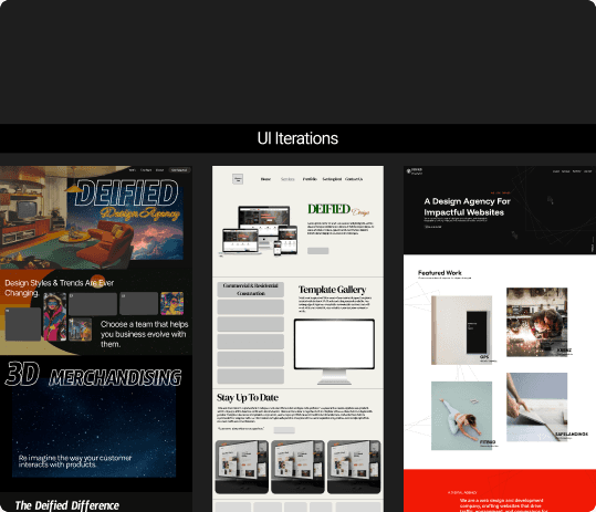
The team members each took on an iteration, I created #3.
UI Iterations
UI Iterations
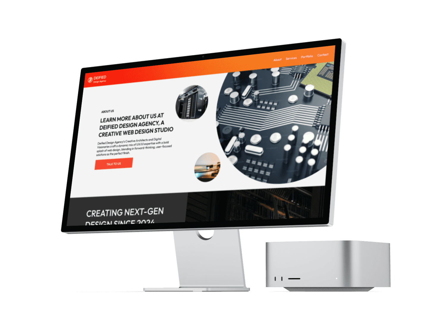
The client shared that they drew inspiration from Old State Design Agency and Agency Partner, which we used as a reference to identify areas for growth. Our goal was to make Deified Design Agency more user-centered and distinct from competitors while ensuring a seamless experience. Since the site would later be developed in Framer, we also kept those constraints in mind throughout the design process, balancing creativity with technical feasibility.
The client shared that they drew inspiration from Old State Design Agency and Agency Partner, which we used as a reference to identify areas for growth. Our goal was to make Deified Design Agency more user-centered and distinct from competitors while ensuring a seamless experience. Since the site would later be developed in Framer, we also kept those constraints in mind throughout the design process, balancing creativity with technical feasibility.
High Fidelity
After presenting our UI iterations to the client, they determined that iteration #3— which I worked on—made the most sense both functionally and aesthetically. From there, our team worked to distribute the refined style across the site. I focused on the case study and portfolio pages, while my team members each took on separate pages. We collaborated closely to ensure a cohesive design, maintaining consistent padding, font sizes, spacing, and colors throughout the platform. Additionally, we each created components within a shared design system to standardize reusable elements. After two rounds of revisions, we finalized our high-fidelity designs.
After presenting our UI iterations to the client, they determined that iteration #3— which I worked on—made the most sense both functionally and aesthetically. From there, our team worked to distribute the refined style across the site. I focused on the case study and portfolio pages, while my team members each took on separate pages. We collaborated closely to ensure a cohesive design, maintaining consistent padding, font sizes, spacing, and colors throughout the platform. Additionally, we each created components within a shared design system to standardize reusable elements. After two rounds of revisions, we finalized our high-fidelity designs.
Hand off & Reflection
Hand off & Reflection
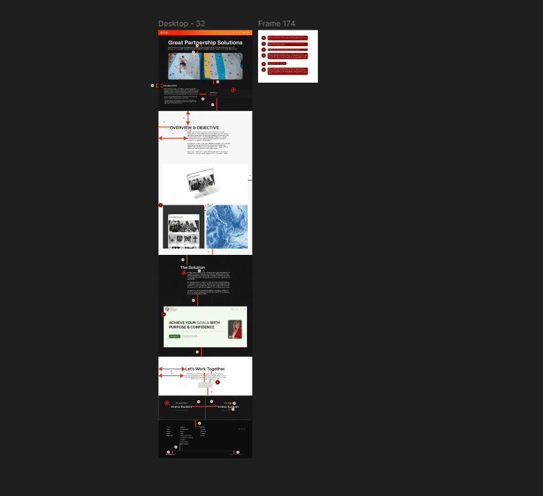
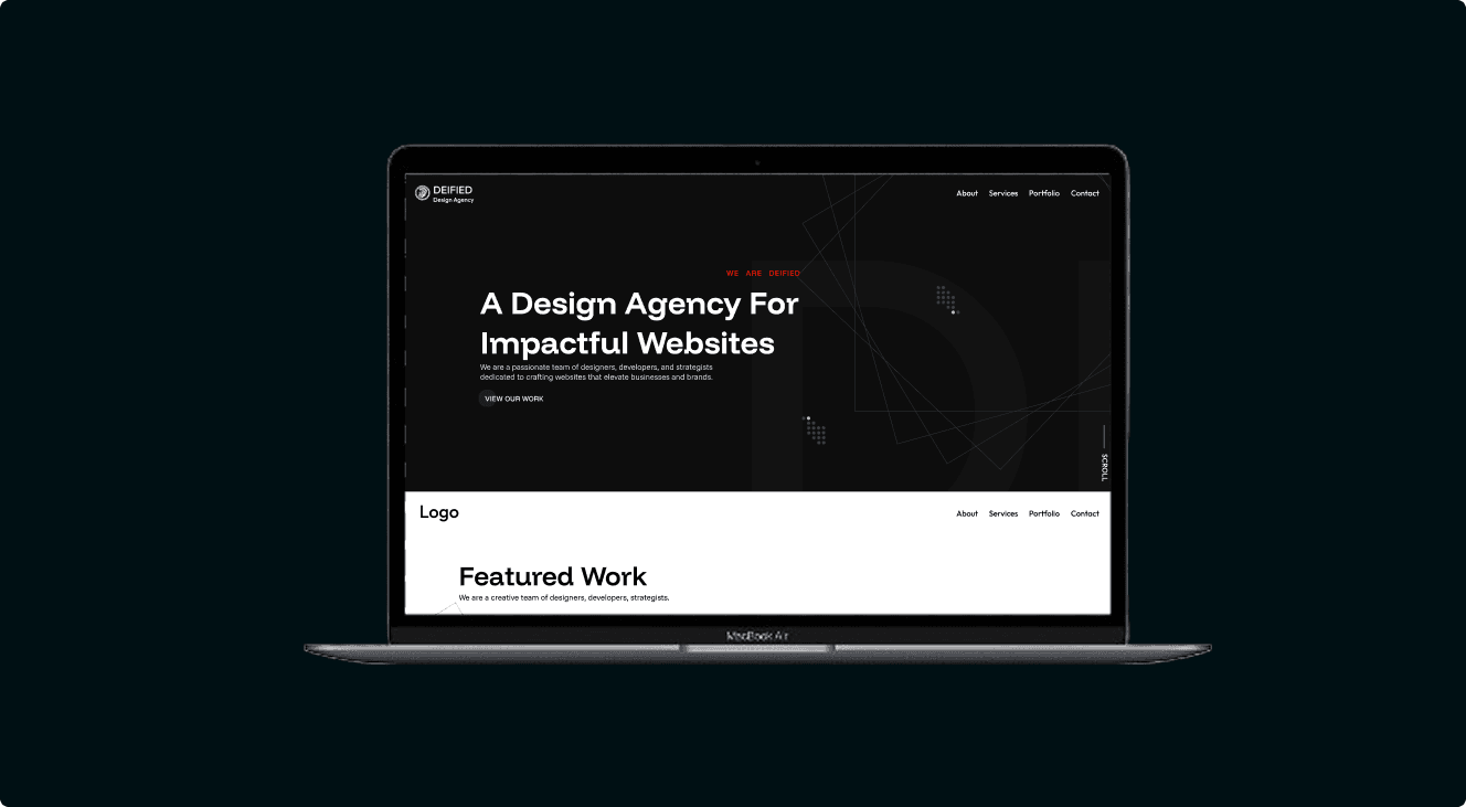
Screenshot of the developer hand off for the case study page
Developer Hand Off
Developer Hand Off
Once the final high-fidelity prototype was approved, we began annotating our designs to ensure a smooth transition to development. We provided precise measurements between elements on each screen, allowing the developer to accurately space and align components. Every feature was carefully annotated to eliminate any ambiguity about how user flows should function. To further streamline the hand-off, we shared the style guide with both the client and developers, ensuring consistency across the final build.
Once the final high-fidelity prototype was approved, we began annotating our designs to ensure a smooth transition to development. We provided precise measurements between elements on each screen, allowing the developer to accurately space and align components. Every feature was carefully annotated to eliminate any ambiguity about how user flows should function. To further streamline the hand-off, we shared the style guide with both the client and developers, ensuring consistency across the final build.
Reflection
Reflection
Leading this project strengthened my communication and collaboration skills. I gained valuable experience working with a team, engaging with clients, and aligning with project managers. The final product was intuitive, engaging, and well-received. This project reinforced the importance of user-centered design and the balance between creativity and functionality. Through collaboration and iteration, we delivered a design that met both the agency’s vision and user needs.
Leading this project strengthened my communication and collaboration skills. I gained valuable experience working with a team, engaging with clients, and aligning with project managers. The final product was intuitive, engaging, and well-received. This project reinforced the importance of user-centered design and the balance between creativity and functionality. Through collaboration and iteration, we delivered a design that met both the agency’s vision and user needs.
More
Projects


More
Projects