Summary
Summary
FITBUD: Your Personal Fitness Companion
FITBUD: Your Personal Fitness Companion
The Challenge
The Challenge
Our team of three was tasked with conceptualizing and designing an innovative fitness app. The challenge lay in creating a seamless user experience that addressed these needs while ensuring modern aesthetics and scalable functionality.
Our team of three was tasked with conceptualizing and designing an innovative fitness app. The challenge lay in creating a seamless user experience that addressed these needs while ensuring modern aesthetics and scalable functionality.
The Solution
The Solution
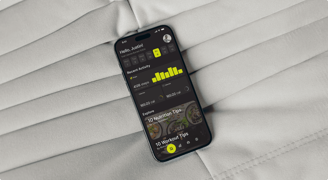
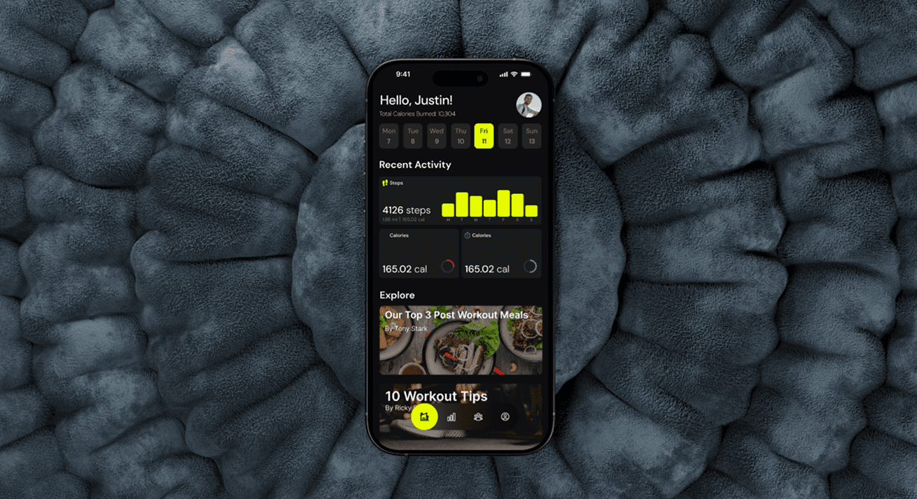
FITBUD is the ultimate solution for fitness enthusiasts seeking motivation and accountability on their wellness journey. By offering group competitions on a dynamic leaderboard based on calories burned. Users can also easily track their diet and workouts.
FITBUD is the ultimate solution for fitness enthusiasts seeking motivation and accountability on their wellness journey. By offering group competitions on a dynamic leaderboard based on calories burned. Users can also easily track their diet and workouts.
My Role
My Role
UX/UI Designer In a Team of 3
UX/UI Designer In a Team of 3
The Process
The Process
User Research
Persona
User Flow
Wire-frame
Guerilla Testing
UI Design
User Testing
Redesign
User Research
Persona
User Flow
Wire-frame
Guerilla Testing
UI Design
User Testing
Redesign
Tools
Tools
Zoom
Figma
Zoom
Figma
The brief
The brief
Learning about the project
This project was born during my time at UTSA. The challenge was simple: design an app—any app—that could solve a real-world problem. Since my team consisted of just myself and another gym rat, and we were both passionate about working out, a fitness-related app was a no-brainer. With a general idea of the field we wanted to focus on, we got to work refining our concept and laying the foundation for what would become MotivateMe and later on Fitbud.
This project was born during my time at UTSA. The challenge was simple: design an app—any app—that could solve a real-world problem. Since my team consisted of just myself and another gym rat, and we were both passionate about working out, a fitness-related app was a no-brainer. With a general idea of the field we wanted to focus on, we got to work refining our concept and laying the foundation for what would become MotivateMe and later on Fitbud.
Research process
Research process
Methods Used
User Interview
Persona
Competitor Analysis
Survey
Proto-Persona & Competitor Analysis
We kicked off this project by developing a proto-persona, giving us a starting point for understanding our target user. This helped us conduct a competitor analysis with a clear user perspective in mind.
We kicked off this project by developing a proto-persona, giving us a starting point for understanding our target user. This helped us conduct a competitor analysis with a clear user perspective in mind.
Through our research, we uncovered a few key insights:
Many fitness apps lacked strong community-building features, even though users wanted more ways to connect.
Some apps allowed users to track their diet but didn’t offer a way to discover new healthy recipes.
Many apps locked social sharing behind a paywall, limiting user engagement unless they upgraded to a premium plan.
We gathered these insights by analyzing customer reviews and conducting hands-on audits of various fitness apps and services.
We gathered these insights by analyzing customer reviews and conducting hands-on audits of various fitness apps and services.
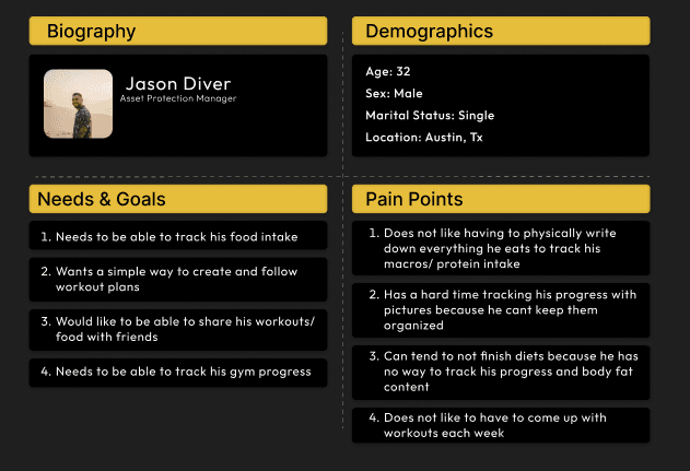
Proto Persona the team and I worked on
Proto Persona the team
and I worked on
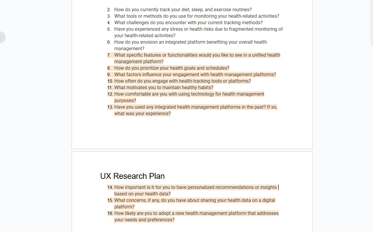
Research Questions I formulated on our research plan.
User Interviews & Surveys
The next step was clear—we needed to find out what users actually want and need in a fitness app! Our research objective was simple: understand user preferences for an integrated health platform.
The next step was clear—we needed to find out what users actually want and need in a fitness app! Our research objective was simple: understand user preferences for an integrated health platform.
To do this, we conducted user interviews and surveys to gain deeper insights into their habits, challenges, and expectations. Here are some of the key findings:
Users wanted to track both dietary goals and fitness targets in one place.
Personalized recommendations and insights based on health data were highly desirable.
Features like calorie counting, workout tracking, and progress visualization (reports, photos, or charts) were must-haves.
Motivation and accountability were the most requested factors to keep users engaged.
Additionally, many users expressed interest in:
Connecting with like-minded individuals for support and encouragement.
Syncing with other apps and smart devices to centralize their health data.
A structured gym plan to eliminate guesswork before workouts.
Learning Moment
At this stage of the project, we should have filtered out which features were truly essential. Instead of trying to pack every possible feature into one app, we should have focused on a select few that provided the most value.
Another oversight was that we didn’t gather much feedback on technical feasibility. Looking back with the knowledge I have now, we simply tried to do too much—but at the time, we couldn’t see that.
I’ll dive deeper into this in the redesign phase, where we learned how to streamline our approach for a more focused and effective product.
Ideation
Ideation
I Like, I Wish, What If
After conducting our research and refining it into a user persona, we had a clear reference point to ensure we were designing for our target audience—fitness-minded individuals aged 20-37.
After conducting our research and refining it into a user persona, we had a clear reference point to ensure we were designing for our target audience—fitness-minded individuals aged 20-37.
When reviewing our I Like, I Wish, What If insights, we identified key features that users found valuable, wished existed, or imagined could improve their fitness journey. Based on this feedback, we decided these features seemed feasible and aimed to create an all-in-one platform, integrating as many of them as possible.
When reviewing our I Like, I Wish, What If insights, we identified key features that users found valuable, wished existed, or imagined could improve their fitness journey. Based on this feedback, we decided these features seemed feasible and aimed to create an all-in-one platform, integrating as many of them as possible.
While this approach was ambitious, it shaped our initial design direction and allowed us to explore the full potential of MotivateMe (now FitBud). However, as we moved forward, we learned the importance of prioritization and feasibility, which we’ll discuss further in the redesign phase.
While this approach was ambitious, it shaped our initial design direction and allowed us to explore the full potential of MotivateMe (now FitBud). However, as we moved forward, we learned the importance of prioritization and feasibility, which we’ll discuss further in the redesign phase.
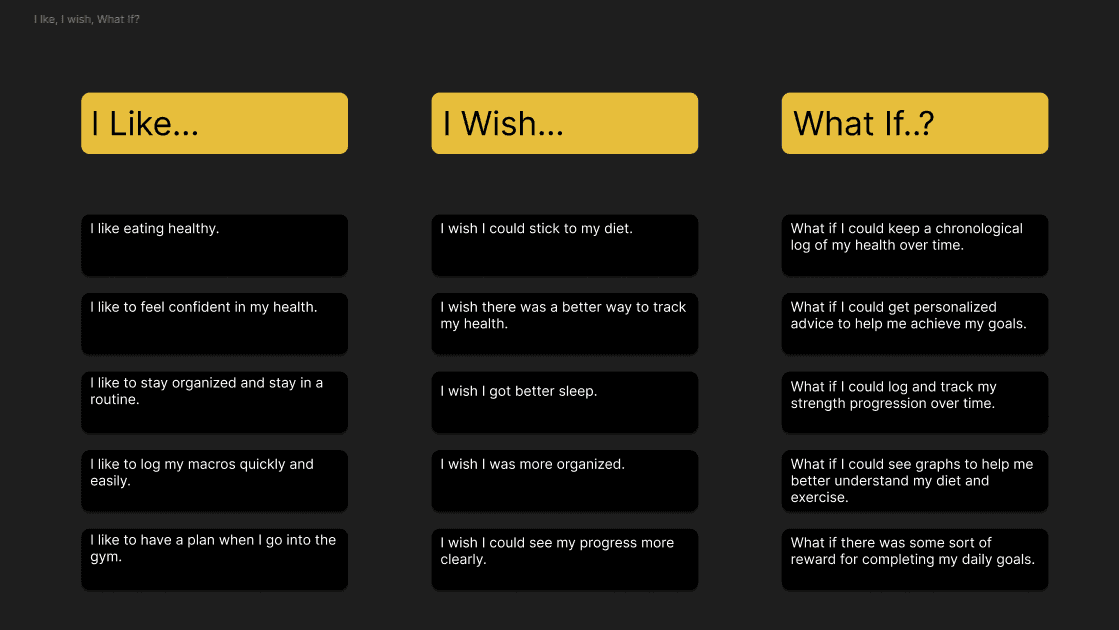
I Like, I Wish, What If...
I Like, I Wish, What If...
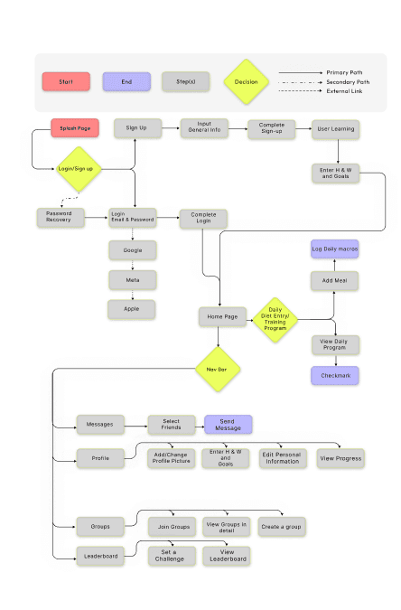
User Flow I formulated from the previous research and ideation.
User Flow I formulated from the previous research and ideation.
User Flow
With our selected features and a clear vision of what we wanted to build, I began working on a user flow. This helped us map out how users would navigate through the platform, ensuring a smooth and intuitive experience.
With our selected features and a clear vision of what we wanted to build, I began working on a user flow. This helped us map out how users would navigate through the platform, ensuring a smooth and intuitive experience.
Looking back, I realize I could have added more detail at each step—specifically outlining user interactions and actions on each page. At the time, my experience was more limited, but even so, the user flow provided a solid foundation to move into the wireframing phase.
Looking back, I realize I could have added more detail at each step—specifically outlining user interactions and actions on each page. At the time, my experience was more limited, but even so, the user flow provided a solid foundation to move into the wireframing phase.
This step reinforced the importance of planning ahead and thinking through the user journey in greater detail—something I’ve since improved on in later projects.
This step reinforced the importance of planning ahead and thinking through the user journey in greater detail—something I’ve since improved on in later projects.
Wireframes
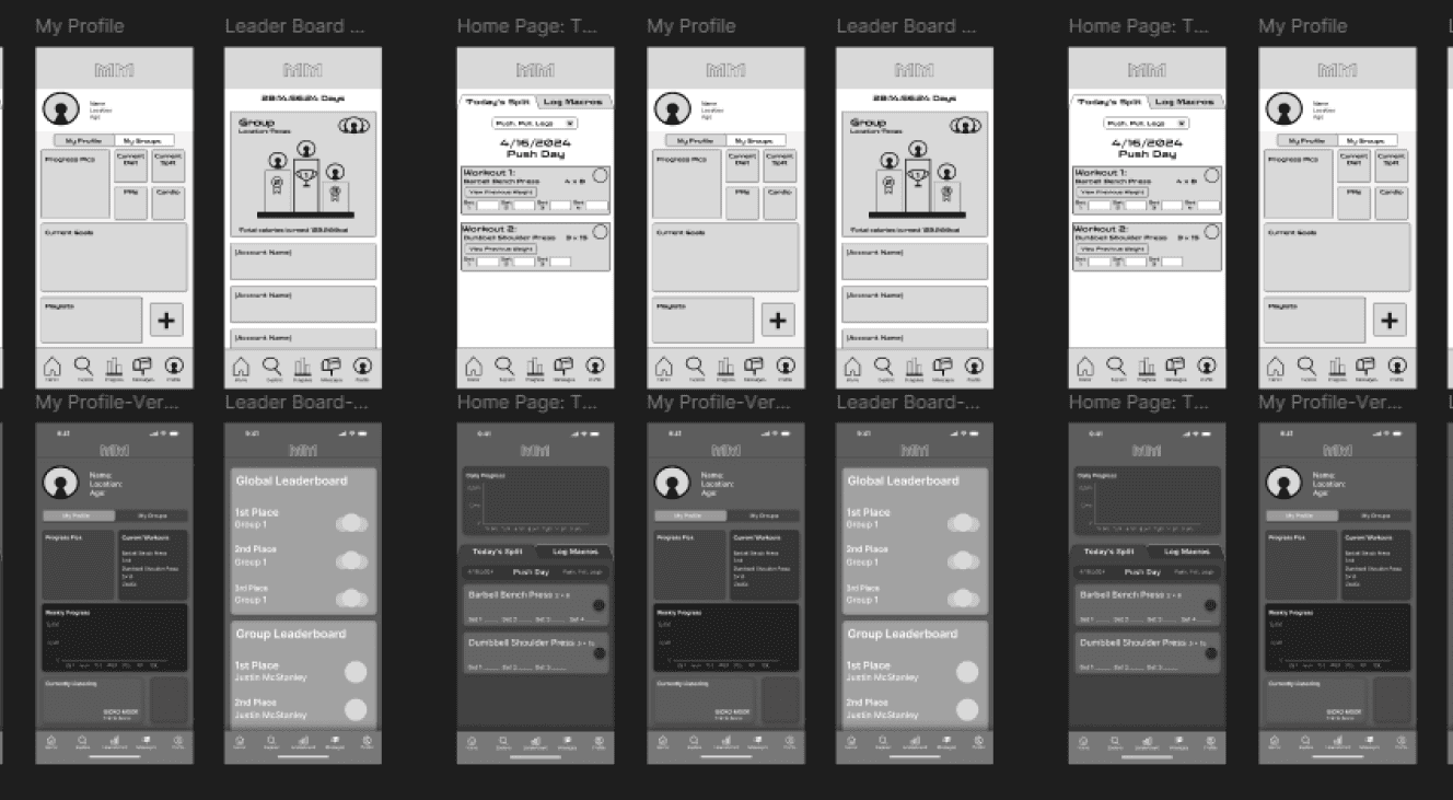
With the user flow mapped out, we moved on to building low-fidelity wireframes. Looking back, it’s clear that these early iterations looked quite different from our final product, but they provided a strong starting point.
At the time, we each created our own version of key pages rather than collaborating on a single wireframe. If I were to approach this now, I would have delegated specific pages to streamline the process and ensure consistency especially with this tight of a timeline the sprint was about 2 weeks. But back then, I was ambitious and believed that multiple iterations would give us more options to choose from.
Another learning moment for sure—but despite this, our wireframes gave us a solid foundation to refine and move forward.
Design, Iterations, and Re-design
Design, Iterations, and Re-design
Style Guide
Ahh yes, everyone’s favorite part—bringing the wireframes to life with color and typography! But first, we had to choose the right colors.
To build a cohesive color palette, we used tools like Realtime Colors, Hue Mint, and Adobe Color. However, at the time, we didn’t dive deeply into color psychology and how different colors evoke specific emotions. Instead, we found a nice-looking palette on Adobe Color, voted on it, and moved forward—same with our font selection.
Looking back, I now see the importance of creating a proper style guide, one that could be handed off to developers and clients to ensure consistency. It’s funny how, in the moment, you feel like you're making the right choices, only to later realize how much more there was to learn. The funny part? I might be having one of those moments right now without even realizing it!
Yet another invaluable learning experience.

Original High Fidelity of the first version of MotivateMe (Fitbud now)
UI Iterations and Redesign
UI Iterations and Redesign
UI Iterations and Redesign
After finalizing our UI, we created a high-fidelity prototype of our initial version of the app. At this point, the original project was technically complete—but this is where the redesign was born.
As weeks went by and I gained more experience with UI design and exposure to other platforms, I couldn’t shake the feeling that this project had so much more potential. I saw areas where we could have refined our approach, particularly by focusing on a few key features instead of trying to do too much at once.
That’s when I decided to take on a solo redesign. I wanted to elevate the project beyond what we originally built, applying what I had learned to create a more focused, user-friendly experience—one that truly delivered on its core purpose. This wasn’t just about fixing mistakes; it was about seeing how far I could push the design with a fresh perspective.
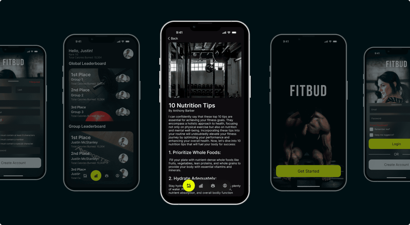
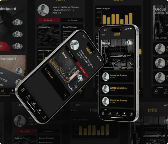
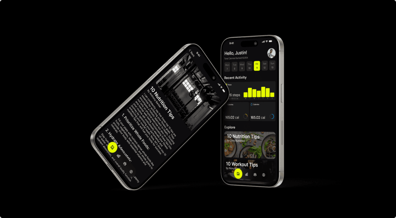
High-Fidelity Design
Once I decided to take on the redesign, I started by revisiting our user research and carefully evaluating our features. I narrowed them down to only the ones that were both critical and innovative, ensuring a more focused and technically feasible product. The core features I kept included:
Community Leaderboard – Encouraging motivation through friendly competition
Diet Intake Tracking – Helping users stay on top of their nutrition
Healthy Recipes Section – Providing easy access to meal ideas
By cutting down on unnecessary features, the app became less cluttered and more user-friendly.
For the visual design, I wanted colors that truly fit the fitness space—something that evoked energy, action, and motivation. I chose a dark primary color to give the interface a bold, sleek feel, and paired it with a vibrant electric green/yellow pop color to bring excitement and contrast to the platform.
This redesign wasn’t just about making the app look better—it was about creating a more purposeful and engaging user experience.
Reflection
Reflection
Reflection
Reflection
Throughout the life cycle of this project, from research to design, I learned a lot about collaboration and how to effectively give feedback—something that could have helped steer our design in a better direction earlier on. But at the end of the day, that’s the point of these school projects: to learn, make mistakes, and grow from them.
This experience also reinforced a crucial lesson—the design process is not linear. It’s a constant cycle of iterations, feedback, more research, and testing. Looking back, I can see how each stage contributed to refining the final product.
This project allowed me to take something that started as MotivateMe—an overly ambitious, cramped design with clashing ketchup-and-mustard colors—and transform it into a clean, well-structured platform that I am truly proud of.
I hope you found value in this case study. As a fellow student, I encourage you to prioritize communication, ensure your design is technically feasible, and always design with your target audience in mind. These lessons made all the difference in my journey, and I hope they do the same for you.
More
Projects


More
Projects
More
Projects